Design systems that stay correct after I've left the team
Design systems, accessible and performant components, and the API design that decides whether a pattern gets used correctly a thousand times — or worked around a thousand times.
The four case studies below are a deliberate sample, not a survey: the same nine years at Germany's largest Q&A platform also covered SSR and GraphQL architecture migrations, full-stack feature work, and new frontends built from 0 to 1.
Four case studies, end to end
Three refactors that each took a pattern that had drifted across a whole product and turned it into a single primitive teams actually reuse — and one product built alone, from schema to legal pages. These are about the decisions, not the diff.
If you only read one: Tooltips & Toggletips for API design and accessibility judgment, Infinite scrolling for performance and building infrastructure instead of features, Modals for design and engineering deciding something together, Of Chapters & Letters for what I do with no team and a fixed deadline.

Tooltips & Toggletips: One visual pattern, two accessibility contracts
Role: Frontend engineer / design system owner · Company: gutefrage.net (high-traffic German Q&A platform) · Scope: Design-system primitive used across the entire product · Outcome: Two components, stable and in production for 6+ years.
Summary
The product had one "tooltip" concept implemented three different ways and used in the hundreds of places. Visually they looked alike; semantically they were two fundamentally different things that a screen reader has to treat completely differently. I researched the accessibility landscape, split the concept into two purpose-built primitives — a Tooltip and a Toggletip — and designed an API that makes the correct, accessible choice the path of least resistance. The result has needed almost no maintenance since.
Context: the status quo
"Tooltip" at gutefrage.net wasn't a component. It was three parallel implementations that had accreted over years:
- a pure CSS attribute approach,
- a web component, and
- a React component.
Between them, they were used hundreds of times across the codebase. Because there were three sources of truth, every tooltip looked slightly different, behaved slightly differently, and none of them were properly accessible. Changing anything — a spacing token, a positioning rule, a keyboard behavior — meant touching three implementations and hoping nothing regressed.
The problem hiding in plain sight
The consistency and maintenance pain was obvious to everyone. The accessibility problem underneath it was invisible — nobody had spotted it, because the two things looked identical on screen:
A tooltip describes an interactive element. A toggletip is content you disclose. They look the same, but a screen reader has to treat them completely differently — and ours were all in one pot.
Concretely:
- A tooltip supplies the accessible name or description of a control that already exists — the label on an icon button, an extra hint on a text field. It's announced as part of that control. It must never contain interactive or critical content, because it can't be reached on touch devices and can be missed under magnification.
- A toggletip is a disclosure: a button that reveals a piece of standalone content. It can hold rich or interactive content, and it needs the disclosure semantics (
aria-expanded,aria-controls) so assistive tech knows there's something to open.
Collapsing both into one "tooltip" meant we were shipping the wrong semantics to assistive technology in a large share of cases. This is the kind of gap that never shows up in a visual QA pass — you only catch it if you understand why the patterns exist, not just what they look like.
Accessibility has been the part of frontend I've cared about most for a long time, so this is where that paid off: nobody on the team had noticed the distinction, and it was that background that let me see it and make the case for fixing it. I raised it, aligned with Product and UX on the scope, and took the initiative to drive the refactoring rather than let it stay a known-unknown.
Approach
I drove this on our regular engineering-initiative day.
1. Research before code. This was pre-AI, so it meant reading — a lot. Tooltips are a genuinely contested corner of accessibility: there is no single agreed best practice, and the expert write-ups disagree with each other. The open questions I had to form an opinion on included:
- Is it acceptable to open on focus, or only on hover + long-press?
- Should the content be auto-announced on open, or not?
- Focus trap or no focus trap — and does that change when interactive content is involved?
- Are interactive elements ever allowed inside?
I worked through the canonical sources (Sarah Higley's Tooltips in the time of WCAG 2.1, Heydon Pickering, Adrian Roselli on disclosure widgets, Inclusive Components, the Primer tooltip-alternatives guidance) and landed on a defensible position for each question, which I then documented inline so the reasoning wouldn't be lost.
2. Split where the API and implementation genuinely diverge. Rather than one component with a mode flag, I built two — Tooltip and Toggletip — because their contracts differ at the root:
- Tooltip triggers on hover and focus (they must go together per WCAG 2.1), plus long-press on touch so the information is reachable without a mouse. It wires itself to its control via
aria-labelledbyoraria-describedby. - Toggletip is a click-driven disclosure built around a button, optionally with a focus trap when it behaves modally.
3. Make the accessible choice the easy one — hard to misuse. The single most important API decision was forcing the label-vs-description distinction to the surface. The Tooltip requires a type:
primary-label— wires uparia-labelledbyand becomes the control's accessible name (e.g. naming an icon button — no separatearia-labelneeded).auxiliary-description— wires uparia-describedbyand is announced as supplementary information.
The developer can't stay ignorant of the distinction, because the type is required and its meaning is documented at the point of use. On top of that:
- Type safety plus runtime guards. A Tooltip must wrap an interactive element; a Toggletip must wrap a
<button>. If you pass the wrong thing, a runtime check logs a clear error. "It's not a tooltip if there's no tool." - Component and hook versions. The standalone components cover the majority of cases with almost no boilerplate;
useTooltip/useToggletipexpose the same behavior as hooks for the cases that need full control. Correctness by default, escape hatch when needed.
4. Tokens as the bridge between design and code. Padding, max-width, placement, wrapping and alignment are expressed as constrained props backed by design tokens — not free-form CSS. That's what keeps every tooltip in the product visually consistent without anyone writing custom styles, and it's the layer where design and engineering actually meet: the designer's spacing and sizing decisions live in the tokens, and the component API only exposes the choices that are allowed to vary. Defaults stay overridable for the rare special case, but the default is the design-system-correct one.
5. Details that matter in production. A few examples of the depth this required:
- Hover open is debounced (a short rest delay, with a fallback timer) via a safe-polygon so the tooltip doesn't flicker as the cursor crosses toward it.
- On touch devices, long-press opens the tooltip and the control's click action adapts accordingly — including suppressing the button's ripple animation to avoid a race between the CSS
:activestate and the JS. - A performance guard: the floating element only computes its position while actually open. On pages with many tooltips this was the difference between a snappy page and a badly janky one.
I built the behavior on a low-level positioning library (Floating UI) for placement and interaction primitives, but the accessibility semantics — the tooltip/toggletip split, label vs description, the disclosure pattern, the touch and focus handling — are all hand-built on top.
6. Documentation as a first-class deliverable. Because the topic is deep and contested, the components ship with extensive inline documentation: what a tooltip is (and isn't), when to reach for a toggletip instead, the common misuse cases, and links to every source that informed a decision. The docs are part of what makes the API hard to misuse.
Rollout — it doesn't count until it's adopted
Building the components was half the work. Getting hundreds of existing usages migrated, by a team, without regressions was the other half:
- Migrated the first real usages myself to validate the API against reality.
- Opened the work for code review and incorporated feedback.
- Guided the rest of the team through the migration of their areas.
- Gave an all-hands talk on tooltip and toggletip accessibility — so the why spread beyond the people who touched the code, and the distinction became shared team knowledge rather than something locked in my head.
Outcome
Two purpose-built primitives that have been stable in production for 6+ years with minimal maintenance — good DX, consistent UX, correct accessibility semantics, and enough flexibility to absorb new cases without new abstractions. Just as important, the team came away understanding why a tooltip and a toggletip are different things, which is what keeps a distinction like this alive over time.
Reflection
For a small product I'd usually start from a headless, already-accessible primitive (Radix, React Aria) today rather than hand-build the semantics. But that's not the situation a design-systems team is in: when you're building the component library itself — the thing other teams depend on — someone still has to own these decisions down to the ARIA, because a headless library can't tell you that your product has been conflating two semantically different patterns. That's exactly the depth this project came from, and the reason I could see the problem in the first place.
The part I value most in hindsight is that the fix outlived me on the team: because I put the why into the documentation and the all-hands talk, the tooltip/toggletip distinction became shared knowledge rather than a decision that quietly eroded the next time someone reached for the "wrong" one. A primitive is only as accessible as the understanding around it.
Infinite scrolling, done properly: a reusable listing system that out-feels the big platforms
Role: Frontend engineer / design system owner · Company: gutefrage.net (high-traffic German Q&A platform) · Scope: Reusable listing infrastructure used across the product · Outcome: An infinite-scroll system whose felt behavior beats Facebook, Reddit and X — plus a listing API that every listing in the product now builds on.
Summary
The product ran on classic URL pagination — page-number buttons at the bottom of every listing — while the rest of the web had moved to infinite scrolling, and we had a broad initiative to make the web app feel more app-like. I set out to build infinite scrolling properly: not just "load more at the bottom," but solving the hard problems the big platforms mostly don't — keeping scroll position across navigation and reloads, keeping the page fast no matter how far you scroll, and staying accessible under a pattern that resists it. I designed it (with a second engineer on the trickier mechanics) as a reusable listing API rather than a one-off, so infinite scroll and classic pagination became two modes of one system that any listing could adopt.
This is the case study furthest from "a visual component," but closest to what frontend engineering actually is: owning how an interaction feels, end to end, and turning it into infrastructure the rest of the team can lean on.
Context: the status quo
Every listing on gutefrage.net was paginated by URL, with page-number buttons at the bottom. That was dated: infinite scrolling had long since become the more modern, expected pattern, and there was a company-wide push to make the web app feel more app-like. There was also a structural problem underneath: listing functionality was largely duplicated across the codebase rather than centralized and reused — so any improvement had to be re-made in many places, and consistency was a matter of discipline rather than design.
So the task was really two tasks: build a genuinely good infinite scroll, and fix the fact that "listing" wasn't a shared thing.
The problems I set out to solve
Before writing anything, I mapped out what "done properly" actually required:
- Performance that never degrades. Memory must not balloon, the DOM must not grow without bound, and the number of mounted React components has to stay in check — so scrolling feels exactly as smooth on the thousandth item as on the tenth.
- Scroll position preserved on back/forward navigation. Tap into a question, hit back, and land exactly where you were — not at the top.
- Scroll position preserved across a page reload. State kept only in memory is lost on reload. This mattered more for us than for most: gutefrage.net deliberately bet on chronological content rather than an algorithmic feed that reshuffles the top on every visit — so losing your place couldn't be papered over by "here's some fresh stuff instead." You'd actually lose the thing you were reading.
- Reusability across very different listings. One system, many listing shapes.
- A user-facing on/off switch. Long-time users are used to classic pagination; forcing the change risked alienating them, so infinite scroll had to be disable-able — which meant classic pagination had to keep working too.
- The unglamorous product question: how many items per page is the right trade-off between requests and payload?
Studying the field
I spent time with how the big platforms actually behave — Facebook, Twitter/X, Reddit. The takeaway was reassuring: none of them solve the whole set. The classic failure is losing scroll state on reload, and several don't reliably remove off-screen content from the DOM, so the page just gets heavier the longer you stay. "As good as the big sites" turned out to be a low bar; the interesting target was the set of problems they leave on the table.
Designing the solution
Working through the mechanics with a second engineer, we landed on an approach built from a few deliberate decisions:
Observe, don't poll. IntersectionObservers (with a scroll observer where needed) drive everything — when to append the next page, when a page is far enough away to unload, when to reload one coming back into range. It's cheaper and smoother than scroll-event math.
Window the list at page granularity. Pages far outside the viewport get unloaded (their content dropped) and reloaded when the user returns near them — which is what keeps memory, DOM size and mounted components bounded over a long session. Two deliberate refinements: the topmost page never unloads (people scroll back to the top constantly, and it should be instant and always reloadable), and reloading is debounced so flinging the scrollbar past dozens of pages doesn't trigger dozens of loads — only the pages that actually settle near the viewport load.
Cache heights so nothing jumps. To preserve scroll position we cache the state of every page in a listing including its measured height. An unloaded page therefore holds exactly the space it occupied when full, so unloading and reloading never causes layout shift — and on back/forward navigation the whole listing rehydrates to the precise scroll position without re-fetching from the top.
Survive a lost cache via the URL. Reloads throw away in-memory cache and, with it, the scroll position. So the current cursor is also persisted in a URL query parameter: if the cache is gone, we redirect to that cursor and land the user near where they were instead of at the very top. Damage limitation as a designed-for case.
We evaluated virtual-list libraries and rejected them — deliberately. Virtualization is well-trodden in native (Flutter, React Native) but genuinely harder on the web, and the mature libraries didn't fit our use case: variable-height content, mixed page types, our caching and scroll-restoration needs. Reaching for a library here would have added a dependency that solved the easy 60% and fought us on the hard 40%. So we built the windowing ourselves — a decision I'd defend, because the "hard 40%" was the point of the project.
The API: listing as a reusable system
The lasting output isn't the scroll behavior — it's useListing, a single declarative API that centralizes listing functionality and offers infinite scroll and classic URL pagination as two modes of one system. A listing declares withInfiniteScrolling, withUrlPagination, or withoutPagination, and the same call handles the rest — empty states, inserted fill-in elements (e.g. ads at given indices), timestamp separators, multi-column layouts — so listing logic stopped being copy-pasted and became one thing.
A few API decisions I care about:
- Data-loading is the caller's contract, not the system's. Each usage decides how and when it loads data by supplying compatible functions and types (
loadPage,nextPageCursor,cursorLink, initial pages). The system owns the orchestration — windowing, caching, restoration — while staying agnostic about the data source (it's generic over the content type and GraphQL-compatible). That separation is why it fits listings as different as a question feed and a search result. - Constrain the cursor types on purpose. Pagination can be cursor-based or classic page-number based; I deliberately limited which cursor shapes the API accepts, finding the sweet spot between flexibility and what listings actually needed. Every extra shape you allow is complexity every future caller pays for — so the right move was to allow the ones we needed and no more.
- Both modes stay first-class. Because infinite scroll is user-disable-able (and, e.g., multi-column desktop layouts fall back to pagination), classic pagination isn't legacy to be tolerated — it's a supported mode the API keeps honest.
Accessibility — delivering the pattern without excluding anyone
Infinite scroll is, by nature, accessibility-hostile, and Product and UX wanted it anyway for good business reasons. I take the frontend engineer's job here to be neither "accessibility says no" nor "the business wins and accessibility loses," but find the change that satisfies both.
The most concrete conflict: an endlessly-loading list means a bottom-anchored footer can never be reached — and in Germany the footer carries legally-required links (Impressum, Datenschutz, AGB). Hiding the footer is unavoidable; losing those links is not acceptable. So we relocated the essential links into the sidebar, reachable on every listing regardless of scroll position and input method. The business gets its pattern; keyboard and screen-reader users don't lose access to pages they're legally entitled to reach. The accessibility constraint reshaped an information-architecture decision — exactly the kind of call that lives between design and engineering.
Rollout
I took it through review with other engineers, then made it the default foundation for all new listings and migrated existing ones over by priority rather than in one risky big-bang. Because it was one API from the start, each migration made the next one cheaper.
Outcome
A web infinite-scroll implementation that, on the details users actually feel — scroll restoration across navigation and reload, zero layout shift, bounded memory over long sessions — is better than what I could get from Facebook, Reddit or X. And it shipped as reusable infrastructure: years of good UX, good DX for the engineers building on it, and accessibility preserved despite the pattern. It's still the listing foundation across the product.
Reflection
Two honest reflections. First, the thing I'd change: I'd push harder to move users onto the new pattern rather than keeping classic pagination alive as a permanent parallel mode. Supporting both indefinitely was a large, ongoing technical cost — every listing had to work two ways forever — and in hindsight a firmer migration (with a transition period) would have bought a much simpler system. Choosing where not to preserve optionality is its own design decision, and I under-weighted it.
Second, the thing I'd keep: the instinct to treat this as infrastructure and as a whole experience — performance, feel, and accessibility as one problem, not three. Layout shift, an unbounded document, a lost scroll position: each of those is a design and accessibility failure before it's a performance metric. That's the same throughline as my other work — sitting between what product and design want and what the technology and accessibility require, and refusing to treat either as the side that has to give.
Modals: centralizing hundreds of one-off dialogs into one accessible system
Role: Frontend engineer / design system owner · Company: gutefrage.net (high-traffic German Q&A platform) · Scope: Design-system molecule used across the entire product · Outcome: A tiered modal API, stable and in production for 8+ years.
Summary
The product had a modal component in name only — every one of the hundreds of usages hand-wired its own CSS classes, layout and buttons. Nothing was consistent, and because nothing was centralized, nothing could be made reliably accessible. Together with a UX designer I audited every modal on the platform and grouped them into a handful of consistent variants; I then designed a tiered modal API that mirrors those variants, centralizes the platform's dialog conventions and its focus management, and deliberately chooses — property by property — where to be rigid (for correctness) and where to be flexible (for real-world needs). It has been stable for 8+ years.
Context: the status quo
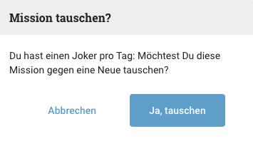
There was a modal component, but it barely earned the name. Each usage had to manually set CSS classes to lay itself out. There was no shared treatment of the platform-specific pieces every modal needs — the headline, the close ("X") button, the footer buttons, their alignment and spacing. So every modal was subtly different, and the product's hundreds of modals had drifted apart.
The consequence that mattered most: accessibility was nearly impossible to guarantee. A dialog has real accessibility obligations — it must trap focus, restore focus on close, be dismissible via Escape, expose the right role/aria-modal/labelling, and manage the backdrop. You can't retrofit those correctly across hundreds of independent implementations. It has to live in one place.
The problem
Three problems, one root cause:
- Inconsistency — no shared layout or platform elements, so modals looked and behaved differently everywhere.
- Poor accessibility — focus management, dismissal and dialog semantics were absent or ad-hoc, and couldn't be fixed centrally because there was no center.
- High cost of change — any improvement had to be repeated by hand across every usage.
Approach
0. Start with a shared audit — design and engineering in the same room. Before any code, the UX designer and I went through every modal on the platform together and categorized them into a small set of consistent variants. That categorization became the backbone of the whole effort: the code ended up mirroring exactly the variants we agreed on, so the design system and the implementation described the same reality. He prepared the designs for most of the modals in Figma; I translated that vision into the API and implementation, and fed technical constraints and necessities back to him where the design and the medium had to meet in the middle. This close back-and-forth — designer intent in one direction, technical reality in the other — is the part I enjoy most, and it's why the resulting system felt native to both sides rather than an engineering artifact designers had to live with.
1. Tier the API to match the variants we defined. I split the surface into layers that differ genuinely in contract — mapping onto the categories from the audit — rather than one component drowning in flags:
BlankModal— the raw, fully-functional dialog: backdrop, focus trap, focus restore, Escape/dismiss, dialog ARIA, portal rendering. No opinions about content.Modal— the standard, opinionated modal built onBlankModal: headline, corner close button, footer buttons, cancel handling — the shape 90% of usages want.- A further centralized variant for the most common, fully-standardized cases.
This means a developer reaches for the highest level that fits and only drops down when they genuinely need to.
2. Choose props vs. components deliberately — this was the core design decision. The interesting question in a modal API is how you expose each part, and the right answer differs per part:
- Props for the things that should be hard to misuse or intentionally inflexible — the headline, the close mechanics, the footer buttons. Critical ones have no default, so you can't accidentally ship a modal without them. Props give me a narrow, controlled surface.
- Components for the things that need real flexibility — e.g. the
aria-describedbycontent, exposed as aModalDescribedBywrapper because its content varies too much to constrain. The trade-off is honest: components are more flexible but easier to misuse, so I only reach for them where flexibility is actually required. - Both, where I want structure and behavior — the footer buttons are configured as structured props (primary / secondary / tertiary / cancel, each with sensible variant defaults) but come with built-in behavior: they auto-close the modal on click, and if a handler returns a promise the buttons disable and the modal waits for it to resolve before closing. The cancel button always just closes, by design. Common needs are generalized so nobody re-implements them.
3. Centralize the accessibility so it's correct once, everywhere. Because the behavior lives in BlankModal, every modal in the product inherits:
- Focus trap — Tab and Shift+Tab wrap around the focusable elements inside the dialog, so keyboard focus can't escape to the page behind it.
- Initial focus — focus moves into the dialog's first focusable element on open.
- Focus restore on close — focus returns to wherever it was before the modal opened. This includes a real-world edge case: if the element that opened the modal has since been removed from the DOM, focus restores to the nearest still-visible ancestor instead of being lost to the document body.
- Escape to dismiss — with event propagation stopped so that nested or stacked modals close one at a time, not all at once.
- Dialog semantics —
role="dialog",aria-modal, andaria-labelledby/aria-describedbywired to the headline and description. - Backdrop-click to close — with one genuinely fiddly production detail: browsers report scrollbar mousedowns as clicks on the element behind them, which would close the modal when a desktop user grabbed the scrollbar. The fix treats the rightmost strip of the backdrop as a safe zone on desktop. (Dismissal also uses
mousedown, notclick, so a drag that starts inside the modal and releases on the backdrop — e.g. selecting text — doesn't close it.) - Browser back button closes the modal via a history interceptor, which is the behavior mobile users expect.
4. Keep it extensible by keeping it simple. The implementation is organized into small, readable hooks (close handling, history interception, focus trap, Escape dismissal) rather than one monolith. Low abstraction and low complexity mean the next person can extend it without reverse-engineering it. There's also an imperative showModal() for the cases that need to open a dialog without an existing React tree.
5. Testability. The behavior is structured so it can be unit-tested with good coverage — the promise-aware button flow, for instance, is deliberately written so async and sync paths are both easy to assert on.
Rollout — adoption is the deliverable
- Migrated the first usages myself to pressure-test the API against real screens.
- Opened it for code review and folded in feedback.
- Guided the team through migrating the rest of the product's modals to the new system.
Outcome
A tiered modal system — consistent platform UX, centralized and correct accessibility, good developer experience, and enough flexibility to cover the special cases — that has been stable in production for 8+ years. Centralizing the dialog conventions once meant every modal in the product got focus management, dismissal and correct semantics for free, and stayed consistent as the product grew.
Reflection
Two things date this implementation, and both are cheap fixes now: the focus trap is a hand-written keyboard interceptor (wrapping Tab across the focusable set) where today I'd use the inert attribute plus the native <dialog> or a headless primitive, and I'd add a proper scroll-lock. Those are mechanics — worth updating, not worth agonizing over.
What actually carries forward — across this refactoring and every other one I've done — is the lesson that's harder to teach: get the foundation and the API right at the start, because that's what decides whether a primitive lasts eight years or accrues eight years of workarounds. The right way usually isn't hard. Yet most codebases still get it wrong, and the failure modes rarely change — a developer reaches for too much abstraction, or doesn't have deep enough expertise in the specific pattern, or quietly forgets one of the principles that keep an API alive (hard to misuse, flexible where it must be, low-abstraction, honest defaults). Our job as engineers is to reduce complexity while holding the outcome constant; abstraction is a tool for that, not a goal in itself. On a team that builds its own design system rather than consuming one, that discipline is the whole ballgame — the tiering and the props-vs-components decisions here are where the real judgment lives, and no library makes them for you.
Of Chapters & Letters: from our own wedding invitation to a product strangers can use
Role: Sole product owner, designer and engineer · Product: chaptersandletters.com, free multilingual online wedding invitations · Scope: everything from the database schema to the landing page to GDPR compliance · Status: built and used for our own wedding, public launch pending.
Summary
My fiancée and I wanted to send our wedding invitations online. Everything on the market was either too expensive for what it did or missed the one thing we actually needed: an international guest list where every guest reads the invitation in their own language. So I built a small thing for exactly one wedding, ours. It worked well enough that the obvious next question was whether other couples could use it too.
The three case studies above are about depth inside a large, mature codebase. This one is the opposite constraint: one person, no team, no design partner, no legal department, and a deadline that could not move, because it was a wedding date. It is the closest thing I have to what a small product team actually asks for. Decide what is worth building, pick a stack you can move fast in, cut what does not earn its cost, and own every layer of it.
Origin: a spec that came from real use
The advantage of building for yourself first is that you skip the guessing. Every requirement came from a constraint we actually hit while planning our own wedding, and every feature had to survive a real guest list before it could ship to anyone else.
Going from "a thing that works for us" to "a thing that works for people I will never talk to" was, as expected, most of the work. What I could previously solve in code now had to become UI someone else understands without me standing next to them. The requirement list grew accordingly: an app-like feel rather than a stack of forms, a design people are happy to send to their guests, an onboarding path that works without explanation, passwordless authentication, and the legal layer any German product handling personal data owes its users.
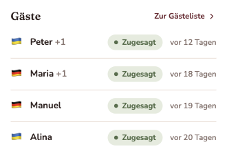
The core features settled on guest management with RSVP, an optional +1 per guest, custom questions to guests ("which song can't be missing?"), the wedding details themselves (schedule, venues, times, photos), and self-registration through a shared link or QR code, for the groups where you simply do not have every address.
Multilingual: a product problem before it is a library problem
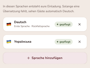
Our wedding is German and Ukrainian, so our invitations had to exist in both languages. This is the requirement that shaped the data model more than any other, because it is really two problems:
- The platform has to be internationalized in the ordinary sense, so the host can work in their own language.
- The content is authored by the host, which means every text a couple writes has to exist in every language they invite in. That is not a translation file. That is a schema decision, an editing experience, and a fallback strategy.
The resolution I landed on is that language is a property of the guest group, not of the browser. Each group gets its own invitation link that renders in the language assigned to it, which is how invitations work offline anyway: you already know which side of the family you are writing to.
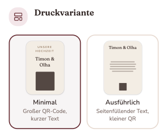
The counterpart is the bridge back to paper. Not every guest wants a link in a messenger app, so the product generates print templates with a QR code leading to the personal online invitation. We used it ourselves: a short printed card carrying no details, and the QR code carrying everything else. A small feature that quietly resolves the tension between "we want a nice card in the post" and "we do not want to reprint sixty cards because the schedule moved."
The stack, and why
I wanted to work with technologies that were new to me, with two non-negotiables: TypeScript and React.
React Router in framework mode for the application layer. It fits the app-like feel I was after, and the deciding factor was that it let me skip global state management almost entirely: loaders and actions revalidate the page's data after every mutation, so there is one source of truth and it is the server. The pitfall it taught me comes with server and client code sharing a language and a repo. Both are TypeScript, and nothing stops you from importing the wrong thing in the wrong place. Discipline is the weak fix here; the strong one is the *.server.ts / *.client.ts convention, which the framework enforces at build time instead of leaving it to me to remember.
Neon (managed Postgres) with Drizzle as ORM. Professionally I was used to imperative migration scripts on MySQL. Drizzle inverts that: the schema is defined in code, wired directly into the type system, and versioned in git. You push the new schema and it derives the diff. Declarative instead of imperative, which at this size is exactly the right trade.
better-auth for authentication. Open source, all data in my own database, a Drizzle adapter, a wide set of methods and, usefully, MCP support. I shipped Google sign-in and magic links. Apple sign-in was cut for a reason worth stating plainly: it requires a paid developer account, and this is a free product.
Resend for transactional mail, which magic links depend on. Free tier, DNS records in, API call out, and a Vercel integration that made the setup a five minute job rather than an afternoon.
Paraglide for i18n, chosen after a long comparison. The criteria were SSR support with a small bundle, sensible message keys, no lock-in on a proprietary notation (ICU stays possible), a good editor integration, and React Router support.
Free on purpose: the layer that is not engineering
The product is free, and that is not generosity, it is the decision that keeps it viable as a one person project.
Charging money changes the legal shape of the thing. Offering features in exchange for payment in Germany means registering a business, a dedicated bank account, tax handling and ongoing obligations, and a payment provider like Paddle removes only part of that. As a free product I can accept donations without any of it. Add a crowded market of paid competitors, and the honest calculation is that the commercial version costs more than it is likely to return. Free is also simply the better product for the audience: weddings are expensive enough already, which is the reason we went looking for an alternative in the first place.
What does not go away is data protection, because the product manages other people's guests. Names, contact details, and potentially dietary requirements, which can imply health conditions or religion and therefore fall into a more sensitive category than a guest list looks like at first glance. That drives concrete product decisions: automated data export and deletion, and automatic deletion of a wedding six months after the date, so the default is that the data disappears rather than accumulates.
It also decided my hosting. I started on Vercel because I knew it and it is fast to move in: serverless, CI/CD, Neon integration, blob storage, domains, good DX for environment variables. I moved to Cloudflare for a legal reason rather than a technical one. Vercel provides the data processing agreement German law requires only on its paid plan; Cloudflare provides it on the free one. For a product that is free by design, a monthly floor on a compliance document is a real constraint.
None of this is engineering, and all of it shaped the product. That is the part of solo work that is hardest to see from inside a larger company, where somebody else owns those questions.
How I worked: learn by hand, then accelerate
I normally develop AI-first, but for a stack I did not know yet I deliberately started without it and built the skeleton by hand, until React Router, Drizzle and Paraglide were things I understood rather than things that worked. Once the first pages stood and my own pace started to feel painfully slow, I switched back.
The conventions I hold myself to when working with Claude Code are the ones that decide whether the output is worth reviewing:
- when the model makes a mistake, fix the cause rather than the instance: the correction goes into
CLAUDE.mdso it cannot recur, - think before prompting, and spend the effort on making the prompt specific,
- and scale review depth to risk, not to diff size. Auth code and anything that will become a widely used API gets read line by line, because that is where tech debt compounds. A small isolated feature does not need the same scrutiny.
Design: a system, a changelog, and why the first screens matter most
Most of the feature work was done when I started using Claude Design, and it changed what was possible for me alone. The product now looks like a UX team made it rather than a developer, and the way there was to treat design the way I treat code.
I set up a proper design system there first: colors, typography, spacing, radii, and base components such as buttons. That transfers into the codebase directly, but the transfer is only as good as the workflow around it. Two things made it work:
A changelog as the interface between design and code. Claude maintains a changelog of design changes on request, so later adjustments are delimited rather than guessed at. Claude Code can read and write the same file and record what has actually been implemented. The rule I follow is to change the design first and hand it to code second, so the two never drift.
Get the first screens right, because errors are inherited. Claude Design builds on previous screens but does not hold the entire history, so an uncorrected mistake propagates silently. My own example: it had invented a group name per guest group ("the Berger family"). No such concept exists in the product, and adding one would only be maintenance work for the host. I corrected it in the code but not in the designs, so it kept resurfacing on later screens. Harmless there. At a central token or component in the design system, the same mistake gets reproduced across dozens of surfaces. Which is exactly what happened with contrast, below.
Accessibility: the part I know best, and the gap I still left
Accessibility is the thread through everything else in this portfolio, so it was a constraint here from the start rather than a pass at the end:
- Native elements first. The browser gets the semantics right for free, and every element I hand-build is a contract I have to keep myself.
- An accessible primitive library. shadcn on top of headless, already-correct primitives, which is precisely the trade I described in the tooltip case study: on a design-system team somebody has to own the ARIA down to the attribute, on a small product you buy that correctness and spend your time elsewhere.
- ARIA patterns where they are genuinely needed, the disclosure pattern being the most frequent.
- Fewer floating elements. Where a popover or overlay was not necessary, I used inline collapsing instead. Floating UI is a category with real problems on touch, under magnification and for keyboard users, and the cheapest way to get it right is not to need it.
And the honest gap: the color contrasts are not sufficient yet. The reason is instructive, because it is the same failure as the invented group name, one level up. Contrast belongs in the design system on day one, as a constraint on the palette itself. I did not put it there, so it is now a correction that touches many places instead of one. That is the exact mistake I spend my professional life preventing in component APIs, made in a medium I was new to.
Automated accessibility tests are still missing, which in a professional setting is where I would start: axe-core in CI, so a regression fails the build rather than waiting for someone to notice.
MCP: designing an API for a probabilistic client
I expect classic UIs to lose ground to chat interfaces over time, and this product is a good test case. Entering a guest list of a few hundred people is tedious through any UI and takes an assistant seconds. Done well it does not just improve the product, it removes the need for features: a structured CSV import is something an AI can simply do, without me building an importer.
So I researched how to build an MCP server properly and shipped one. It builds on OAuth, which is a sensible foundation, and a single standard that every AI provider can implement is good news for anyone who remembers the years before USB.
The interesting part is that the API has to be shaped differently from one behind a normal UI:
- No assumed client-side state. A web UI can afford one endpoint that syncs the whole guest list, because the client holds the whole list. An assistant may not have every guest in context, so the right surface is small, precise operations:
addGuest,removeGuest, and so on. - Hard to misuse, because the caller is probabilistic. A model can drop a guest. A sync-everything endpoint turns that small error into a destructive write; a granular one turns it into a missing entry the user can see and fix. Blast radius per call is a design parameter.
- Descriptions are part of the product. The model is not clairvoyant. It needs to know what the product is, how its parts relate, which endpoint to prefer when two look similar, and what to do when a user asks for a quick start. Writing those is closer to onboarding a new colleague than to writing an API spec.
This is the same principle as the tooltip and modal APIs above, applied to a caller who is not a developer: make the correct path the easy one, and the incorrect one hard to express.
What I deliberately did not build
Scope discipline is most of what makes a solo project finishable, so the cuts are as much a part of this as the features:
- Print templates stay simple. Proper PDF generation is a genuine project of its own, and the value over a clean printable page is small when the card only has to carry a QR code.
- Three invitation designs, not a theme editor. Enough range to feel like a choice, far less surface than a customization system.
- No Apple sign-in, because a paid developer account is not justifiable in a free product.
- No commercial tier, for the reasons above.
Each of these is reversible, and none of them blocked shipping. That is the test I applied.
Outcome
A product built end to end by one person: schema, auth, i18n, design system, print output, landing page, legal pages, hosting and an MCP integration. It carried our own wedding, which is the only user test I really needed, and the public version follows once the remaining legal pieces are complete.
It is the deliberate counterweight to the rest of this portfolio. Those projects show how deep I go inside one layer of a mature system. This one shows the range: choosing the stack, cutting scope, owning the product and legal decisions, and shipping to a deadline with nobody to hand a problem to. Reach was never the goal, and I am not planning to push it commercially, so the interesting measure here is the decisions rather than a user count.
Reflection
The part I would keep is starting from a real need instead of a hypothesis. It is a small product, but not a speculative one, and I never had to invent a user.
The part that surprised me is how much of shipping a product is not engineering. An Apple sign-in cut over a developer account fee, a hosting migration triggered by which plan includes a data processing agreement, a pricing model chosen largely by German business law: none of those are technical decisions, and all of them changed the product.
The part I got wrong is the one I should have seen coming. Contrast belonged in the design system on day one, and leaving it out turned a constraint into a cleanup. It is the same lesson as every refactoring in this portfolio, arriving from an unfamiliar direction: the foundation decides what everything above it costs, and being new to the medium is exactly when you are least likely to notice you are laying one.
AI is worth what you bring to it
I’ve worked AI-first for years, across two very different situations — and the contrast taught me more than either alone. In a codebase I’d known for seven years, the model was a force multiplier: I could spec intent down to the detail, and I knew the instant it drifted, because I already knew every failure mode. In a new domain — a native app where I was the newcomer, not the model — I leaned on it harder and shipped fast, but I felt the difference: velocity went up, and the guarantee of correctness still had to come from me.
That’s the whole lesson, and it’s why I go deeper on a pattern rather than less. AI doesn’t replace the depth in the three projects above — it raises the ceiling on it. Knowing exactly why a tooltip isn’t a toggletip, or where a modal’s focus has to land, is what lets me point the tools precisely and catch them the moment they’re wrong.
Why this site shows the thinking, not the source
Most of my work has lived inside products rather than public repos. At gutefrage.net I built a large part of the frontend foundation — a design system stable in production for the better part of a decade, WCAG 2.1 AA support built in from the ground up, and axe-core running in CI so accessibility regressions fail the build. That code sits behind an NDA, so this site doesn’t show source — it shows the thinking: what the problem really was, why each API looks the way it does, and what I’d carry forward.
Fittingly, the site itself was designed and built with Claude Design and Claude Code — the page you’re reading is a small sample of the AI-assisted way of working described just above.
Let’s talk
I’m happy to walk through the reasoning, the trade-offs, and the parts I’d do differently. The fastest way to reach me is email.
Impressum
Angaben gemäß § 5 DDG
Timon Witt
Georgstr. 12
94034 Passau
Kontakt
Telefon: 015123558074
E-Mail: timon.witt@gmail.com
Datenschutzerklärung
1. Datenschutz auf einen Blick
Allgemeine Hinweise
Die folgenden Hinweise geben einen einfachen Überblick darüber, was mit Ihren personenbezogenen Daten passiert, wenn Sie diese Website besuchen. Personenbezogene Daten sind alle Daten, mit denen Sie persönlich identifiziert werden können. Ausführliche Informationen zum Thema Datenschutz entnehmen Sie unserer unter diesem Text aufgeführten Datenschutzerklärung.
Datenerfassung auf dieser Website
Wer ist verantwortlich für die Datenerfassung auf dieser Website?
Die Datenverarbeitung auf dieser Website erfolgt durch den Websitebetreiber. Dessen Kontaktdaten können Sie dem Abschnitt „Hinweis zur verantwortlichen Stelle" in dieser Datenschutzerklärung entnehmen.
Wie erfassen wir Ihre Daten?
Ihre Daten werden zum einen dadurch erhoben, dass Sie uns diese mitteilen. Hierbei kann es sich z. B. um Daten handeln, die Sie uns per E-Mail mitteilen.
Andere Daten werden automatisch oder nach Ihrer Einwilligung beim Besuch der Website durch unsere IT-Systeme erfasst. Das sind vor allem technische Daten (z. B. Internetbrowser, Betriebssystem oder Uhrzeit des Seitenaufrufs). Die Erfassung dieser Daten erfolgt automatisch, sobald Sie diese Website betreten.
Wofür nutzen wir Ihre Daten?
Die Daten werden erhoben, um eine fehlerfreie Bereitstellung der Website zu gewährleisten.
Welche Rechte haben Sie bezüglich Ihrer Daten?
Sie haben jederzeit das Recht, unentgeltlich Auskunft über Herkunft, Empfänger und Zweck Ihrer gespeicherten personenbezogenen Daten zu erhalten. Sie haben außerdem ein Recht, die Berichtigung oder Löschung dieser Daten zu verlangen. Wenn Sie eine Einwilligung zur Datenverarbeitung erteilt haben, können Sie diese Einwilligung jederzeit für die Zukunft widerrufen. Außerdem haben Sie das Recht, unter bestimmten Umständen die Einschränkung der Verarbeitung Ihrer personenbezogenen Daten zu verlangen. Des Weiteren steht Ihnen ein Beschwerderecht bei der zuständigen Aufsichtsbehörde zu.
Hierzu sowie zu weiteren Fragen zum Thema Datenschutz können Sie sich jederzeit an uns wenden.
2. Hosting
Wir hosten die Inhalte unserer Website bei folgendem Anbieter:
Externes Hosting
Diese Website wird extern gehostet. Die personenbezogenen Daten, die auf dieser Website erfasst werden, werden auf den Servern des Hosters / der Hoster gespeichert. Hierbei kann es sich v. a. um IP-Adressen, Meta- und Kommunikationsdaten, Websitezugriffe und sonstige Daten, die über eine Website generiert werden, handeln.
Das externe Hosting erfolgt im Interesse einer sicheren, schnellen und effizienten Bereitstellung unseres Online-Angebots durch einen professionellen Anbieter (Art. 6 Abs. 1 lit. f DSGVO).
Unser(e) Hoster wird bzw. werden Ihre Daten nur insoweit verarbeiten, wie dies zur Erfüllung seiner Leistungspflichten erforderlich ist und unsere Weisungen in Bezug auf diese Daten befolgen.
Wir setzen folgende(n) Hoster ein:
Vercel Inc.
440 N Barranca Avenue #4133
Covina, CA 91723
United States
3. Allgemeine Hinweise und Pflichtinformationen
Datenschutz
Die Betreiber dieser Seiten nehmen den Schutz Ihrer persönlichen Daten sehr ernst. Wir behandeln Ihre personenbezogenen Daten vertraulich und entsprechend den gesetzlichen Datenschutzvorschriften sowie dieser Datenschutzerklärung.
Wenn Sie diese Website benutzen, werden verschiedene personenbezogene Daten erhoben. Personenbezogene Daten sind Daten, mit denen Sie persönlich identifiziert werden können. Die vorliegende Datenschutzerklärung erläutert, welche Daten wir erheben und wofür wir sie nutzen. Sie erläutert auch, wie und zu welchem Zweck das geschieht.
Wir weisen darauf hin, dass die Datenübertragung im Internet (z. B. bei der Kommunikation per E-Mail) Sicherheitslücken aufweisen kann. Ein lückenloser Schutz der Daten vor dem Zugriff durch Dritte ist nicht möglich.
Hinweis zur verantwortlichen Stelle
Die verantwortliche Stelle für die Datenverarbeitung auf dieser Website ist:
Timon Witt
Georgstr. 12
94034 Passau
Telefon: 015123558074
E-Mail: timon.witt@gmail.com
Verantwortliche Stelle ist die natürliche oder juristische Person, die allein oder gemeinsam mit anderen über die Zwecke und Mittel der Verarbeitung von personenbezogenen Daten (z. B. Namen, E-Mail-Adressen o. Ä.) entscheidet.
Speicherdauer
Soweit innerhalb dieser Datenschutzerklärung keine speziellere Speicherdauer genannt wurde, verbleiben Ihre personenbezogenen Daten bei uns, bis der Zweck für die Datenverarbeitung entfällt. Wenn Sie ein berechtigtes Löschersuchen geltend machen oder eine Einwilligung zur Datenverarbeitung widerrufen, werden Ihre Daten gelöscht, sofern wir keine anderen rechtlich zulässigen Gründe für die Speicherung Ihrer personenbezogenen Daten haben (z. B. steuer- oder handelsrechtliche Aufbewahrungsfristen); im letztgenannten Fall erfolgt die Löschung nach Fortfall dieser Gründe.
Allgemeine Hinweise zu den Rechtsgrundlagen der Datenverarbeitung auf dieser Website
Sofern Sie in die Datenverarbeitung eingewilligt haben, verarbeiten wir Ihre personenbezogenen Daten auf Grundlage von Art. 6 Abs. 1 lit. a DSGVO bzw. Art. 9 Abs. 2 lit. a DSGVO, sofern besondere Datenkategorien nach Art. 9 Abs. 1 DSGVO verarbeitet werden. Im Falle einer ausdrücklichen Einwilligung in die Übertragung personenbezogener Daten in Drittstaaten erfolgt die Datenverarbeitung außerdem auf Grundlage von Art. 49 Abs. 1 lit. a DSGVO. Sofern Sie in die Speicherung von Cookies oder in den Zugriff auf Informationen in Ihr Endgerät (z. B. via Device-Fingerprinting) eingewilligt haben, erfolgt die Datenverarbeitung zusätzlich auf Grundlage von § 25 Abs. 1 TDDDG. Die Einwilligung ist jederzeit widerrufbar. Sind Ihre Daten zur Vertragserfüllung oder zur Durchführung vorvertraglicher Maßnahmen erforderlich, verarbeiten wir Ihre Daten auf Grundlage des Art. 6 Abs. 1 lit. b DSGVO. Des Weiteren verarbeiten wir Ihre Daten, sofern diese zur Erfüllung einer rechtlichen Verpflichtung erforderlich sind, auf Grundlage von Art. 6 Abs. 1 lit. c DSGVO. Die Datenverarbeitung kann ferner auf Grundlage unseres berechtigten Interesses nach Art. 6 Abs. 1 lit. f DSGVO erfolgen. Über die jeweils im Einzelfall einschlägigen Rechtsgrundlagen wird in den folgenden Absätzen dieser Datenschutzerklärung informiert.
Empfänger von personenbezogenen Daten
Im Rahmen unserer Geschäftstätigkeit arbeiten wir mit verschiedenen externen Stellen zusammen. Dabei ist teilweise auch eine Übermittlung von personenbezogenen Daten an diese externen Stellen erforderlich. Wir geben personenbezogene Daten nur dann an externe Stellen weiter, wenn dies im Rahmen einer Vertragserfüllung erforderlich ist, wenn wir gesetzlich hierzu verpflichtet sind (z. B. Weitergabe von Daten an Steuerbehörden), wenn wir ein berechtigtes Interesse nach Art. 6 Abs. 1 lit. f DSGVO an der Weitergabe haben oder wenn eine sonstige Rechtsgrundlage die Datenweitergabe erlaubt.
Widerruf Ihrer Einwilligung zur Datenverarbeitung
Viele Datenverarbeitungsvorgänge sind nur mit Ihrer ausdrücklichen Einwilligung möglich. Sie können eine bereits erteilte Einwilligung jederzeit widerrufen. Die Rechtmäßigkeit der bis zum Widerruf erfolgten Datenverarbeitung bleibt vom Widerruf unberührt.
Widerspruchsrecht gegen die Datenerhebung in besonderen Fällen sowie gegen Direktwerbung (Art. 21 DSGVO)
WENN DIE DATENVERARBEITUNG AUF GRUNDLAGE VON ART. 6 ABS. 1 LIT. E ODER F DSGVO ERFOLGT, HABEN SIE JEDERZEIT DAS RECHT, AUS GRÜNDEN, DIE SICH AUS IHRER BESONDEREN SITUATION ERGEBEN, GEGEN DIE VERARBEITUNG IHRER PERSONENBEZOGENEN DATEN WIDERSPRUCH EINZULEGEN; DIES GILT AUCH FÜR EIN AUF DIESE BESTIMMUNGEN GESTÜTZTES PROFILING. DIE JEWEILIGE RECHTSGRUNDLAGE, AUF DENEN EINE VERARBEITUNG BERUHT, ENTNEHMEN SIE DIESER DATENSCHUTZERKLÄRUNG. WENN SIE WIDERSPRUCH EINLEGEN, WERDEN WIR IHRE BETROFFENEN PERSONENBEZOGENEN DATEN NICHT MEHR VERARBEITEN, ES SEI DENN, WIR KÖNNEN ZWINGENDE SCHUTZWÜRDIGE GRÜNDE FÜR DIE VERARBEITUNG NACHWEISEN, DIE IHRE INTERESSEN, RECHTE UND FREIHEITEN ÜBERWIEGEN ODER DIE VERARBEITUNG DIENT DER GELTENDMACHUNG, AUSÜBUNG ODER VERTEIDIGUNG VON RECHTSANSPRÜCHEN (WIDERSPRUCH NACH ART. 21 ABS. 1 DSGVO).
WERDEN IHRE PERSONENBEZOGENEN DATEN VERARBEITET, UM DIREKTWERBUNG ZU BETREIBEN, SO HABEN SIE DAS RECHT, JEDERZEIT WIDERSPRUCH GEGEN DIE VERARBEITUNG SIE BETREFFENDER PERSONENBEZOGENER DATEN ZUM ZWECKE DERARTIGER WERBUNG EINZULEGEN; DIES GILT AUCH FÜR DAS PROFILING, SOWEIT ES MIT SOLCHER DIREKTWERBUNG IN VERBINDUNG STEHT. WENN SIE WIDERSPRECHEN, WERDEN IHRE PERSONENBEZOGENEN DATEN ANSCHLIESSEND NICHT MEHR ZUM ZWECKE DER DIREKTWERBUNG VERWENDET (WIDERSPRUCH NACH ART. 21 ABS. 2 DSGVO).
Beschwerderecht bei der zuständigen Aufsichtsbehörde
Im Falle von Verstößen gegen die DSGVO steht den Betroffenen ein Beschwerderecht bei einer Aufsichtsbehörde, insbesondere in dem Mitgliedstaat ihres gewöhnlichen Aufenthalts, ihres Arbeitsplatzes oder des Orts des mutmaßlichen Verstoßes zu. Das Beschwerderecht besteht unbeschadet anderweitiger verwaltungsrechtlicher oder gerichtlicher Rechtsbehelfe.
Recht auf Datenübertragbarkeit
Sie haben das Recht, Daten, die wir auf Grundlage Ihrer Einwilligung oder in Erfüllung eines Vertrags automatisiert verarbeiten, an sich oder an einen Dritten in einem gängigen, maschinenlesbaren Format aushändigen zu lassen. Sofern Sie die direkte Übertragung der Daten an einen anderen Verantwortlichen verlangen, erfolgt dies nur, soweit es technisch machbar ist.
Auskunft, Berichtigung und Löschung
Sie haben im Rahmen der geltenden gesetzlichen Bestimmungen jederzeit das Recht auf unentgeltliche Auskunft über Ihre gespeicherten personenbezogenen Daten, deren Herkunft und Empfänger und den Zweck der Datenverarbeitung und ggf. ein Recht auf Berichtigung oder Löschung dieser Daten. Hierzu sowie zu weiteren Fragen zum Thema personenbezogene Daten können Sie sich jederzeit an uns wenden.
Recht auf Einschränkung der Verarbeitung
Sie haben das Recht, die Einschränkung der Verarbeitung Ihrer personenbezogenen Daten zu verlangen. Hierzu können Sie sich jederzeit an uns wenden. Das Recht auf Einschränkung der Verarbeitung besteht in folgenden Fällen:
- Wenn Sie die Richtigkeit Ihrer bei uns gespeicherten personenbezogenen Daten bestreiten, benötigen wir in der Regel Zeit, um dies zu überprüfen. Für die Dauer der Prüfung haben Sie das Recht, die Einschränkung der Verarbeitung Ihrer personenbezogenen Daten zu verlangen.
- Wenn die Verarbeitung Ihrer personenbezogenen Daten unrechtmäßig geschah/geschieht, können Sie statt der Löschung die Einschränkung der Datenverarbeitung verlangen.
- Wenn wir Ihre personenbezogenen Daten nicht mehr benötigen, Sie sie jedoch zur Ausübung, Verteidigung oder Geltendmachung von Rechtsansprüchen benötigen, haben Sie das Recht, statt der Löschung die Einschränkung der Verarbeitung Ihrer personenbezogenen Daten zu verlangen.
- Wenn Sie einen Widerspruch nach Art. 21 Abs. 1 DSGVO eingelegt haben, muss eine Abwägung zwischen Ihren und unseren Interessen vorgenommen werden. Solange noch nicht feststeht, wessen Interessen überwiegen, haben Sie das Recht, die Einschränkung der Verarbeitung Ihrer personenbezogenen Daten zu verlangen.
Wenn Sie die Verarbeitung Ihrer personenbezogenen Daten eingeschränkt haben, dürfen diese Daten – von ihrer Speicherung abgesehen – nur mit Ihrer Einwilligung oder zur Geltendmachung, Ausübung oder Verteidigung von Rechtsansprüchen oder zum Schutz der Rechte einer anderen natürlichen oder juristischen Person oder aus Gründen eines wichtigen öffentlichen Interesses der Europäischen Union oder eines Mitgliedstaats verarbeitet werden.
SSL- bzw. TLS-Verschlüsselung
Diese Seite nutzt aus Sicherheitsgründen und zum Schutz der Übertragung vertraulicher Inhalte, wie zum Beispiel Anfragen, die Sie an uns als Seitenbetreiber senden, eine SSL- bzw. TLS-Verschlüsselung. Eine verschlüsselte Verbindung erkennen Sie daran, dass die Adresszeile des Browsers von „http://" auf „https://" wechselt und an dem Schloss-Symbol in Ihrer Browserzeile.
Wenn die SSL- bzw. TLS-Verschlüsselung aktiviert ist, können die Daten, die Sie an uns übermitteln, nicht von Dritten mitgelesen werden.
Widerspruch gegen Werbe-E-Mails
Der Nutzung von im Rahmen der Impressumspflicht veröffentlichten Kontaktdaten zur Übersendung von nicht ausdrücklich angeforderter Werbung und Informationsmaterialien wird hiermit widersprochen. Die Betreiber der Seiten behalten sich ausdrücklich rechtliche Schritte im Falle der unverlangten Zusendung von Werbeinformationen, etwa durch Spam-E-Mails, vor.